
Posted by 256
January 29th, 2015
When infographics arrived on the scene, their minimal and sharp design had real click-bait potential, as they made complex information accessible and entertaining. There was a widely adopted format for these long-form graphics– pastel shades and minimal designs all ordered into neat boxes and witty interpretations. Soon, everyone wanted a slice of this delicious vector pie.
However, cute icons, bar charts, pie charts and waving box-men began to look a little repetitive, as infographics of all shapes and sizes began to flood the market. After a while, there were enough bars and pies to feed an army of waving box-men who were taking over the internet.
Another problem was also raising its head. Digital marketing agencies were building infographics just for the hell of it, not as the answer to specific content goals. They became a good disguise for useless info and fluff, and it was difficult to decipher between the juicy info and the ‘all brawn and no brains’ material.
What is the future of infographics?
Infographics have a firm role in the future of content marketing, we believe. However, with the advent of Google’s ninja-Penguin algorithm and the need for quality content, only relevant and insightful infographics will manage to cut through the clutter.
Thanks to this infographic-craze, we now have heightened design standards for presentations, social posts, websites and digital campaigns. Picktochart was one great result of this new culture of visual delights. This tool aims to help the masses serve up quality graphics, and is a handy quick-solution for sprucing up information for a presentation, blog, or social post. So here’s a helpful break-down of the key elements of Picktochart.
An infographic menu
The first thing you see when you enter the Picktochart website is the ability to choose a graphic format – would you like a presentation, a report, banner or long-form infographic sir?
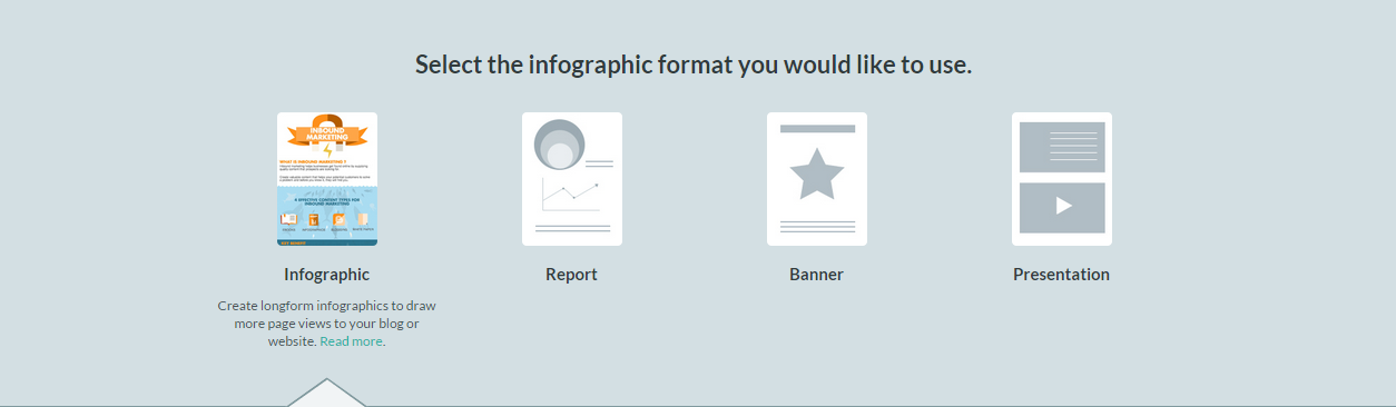
Hum, how kind of you to ask, Picktochart. This is a nifty feature, as choosing from a pre-designed template for your needs makes the process very fast and it really prompts users to think strategically about their information.
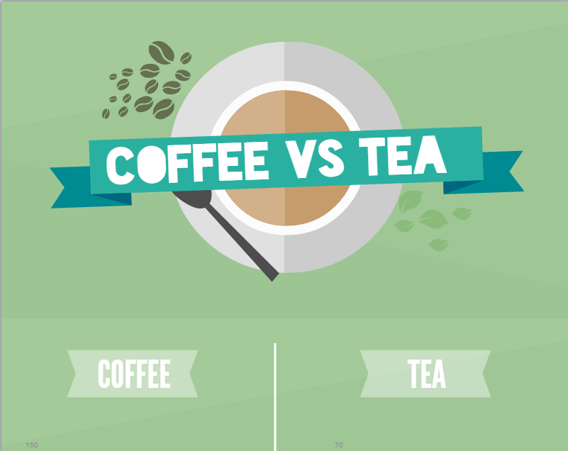
Sweet Templation: Ten free infographic templates
Picktochart gives you ten different templates with the free version. However these can be used only as a very rough starting point to give structure to your graphic. This is because these templates are either too generic or too specific – for example, one template portrays a comparison between coffee and tea.
If you’re a free spirit or experienced Pikto-charter you can choose the blank canvas, which will allow you to create a graphic from scratch.
User friendly features
- Picktochart is generally simple to use. The template is helpfully divided into four layers or blocks which can be ordered, resized and recoloured according to your project (or your mood)
- Picktochart has just four tools which easily allow you to add elements to create your own infographic. These include: text boxes, a number of graphics/icons, your own uploaded graphics (limited to 20 for the free version) and a tool-box for presenting statistical information such as charts and geographical maps
- The tool also has some really nice additional features which gives it a clean, professional feel. A limited number of shapes can be combined into groups to create your own graphic. This allows you to be somewhat creative; although once you’ve brought them together it is impossible to tear them apart again or ‘ungroup’ them.
- You can change the opacity levels and colours of each object
- You can insert nifty info-tags which appear only when you hover over a chart or map
The not-so-friendly features
On the down side for the free version there are a limited number of icons, text-box designs, and a restriction to the amount of graphics you can upload. This limitation could put a lid on creative development of ideas and concepts and in doing so gives your infographic a faint whiff of blandness
With great free graphics comes great responsibility
Picktochart is very easy to use. Suspiciously easy, one might say.
Why is there such a limited amount of tools available to create such a complex piece of content? This is because although Picktochart may allow you to create a professional looking graphic, it does not allow you to interpret or ‘depickt’ your information in a unique or innovative way.
In a saturated market and a digital environment which rewards sharp, relevant content, infographics should be able to communicate unique or complex information in the most creative and enlightening way possible.
To really bring your ideas or marketing goals to life, you make get a better return on your investment in infographics by using a professional team of content creators and designers who have a range of professional software and expertise at their fingertips.
Why use Piktochart?
Using Piktochart is a good idea if you have a small amount of data or a simple idea which you need to push out quickly. It is a great quick-solution tool to embellish a blog post or to brighten a presentation or social post.
Here at 256 Media we know that sharp content goes hand-in-hand with innovative design, so if you want to create an infographic with impact, why not get in touch?

Previous Post
Award winning content marketing in Ireland

Next Post

Infographics in Ireland - what to try and what to avoid
You may also like...

Nicole Thomsen | Dec 11, 2023

Nicole Thomsen | Nov 6, 2023
Nadia Reckmann | Nov 2, 2023